Balancing Act: Discovering the Magic of Low, Mid, and High Chroma in Design
- Journalising Designers
- Jul 22, 2025
- 4 min read

Understanding color can often feel like an intricate puzzle, especially when it comes to design. One of the main aspects that designers tackle is "chroma." But what exactly is chroma, and how does it play into the designs we encounter daily? This post takes you on a journey through low, mid, and high chroma, exploring their unique characteristics and applications in design.
What is Chroma?
Chroma refers to the purity or intensity of a color, which is often depicted on a scale from low to high. Low chroma colors are muted and subdued, while high chroma colors are vibrant and bright. Mid chroma sits neatly in between these two extremes, embodying a balance that combines the traits of both low and high chroma.
Each type of chroma brings its own set of emotions and associations, influencing how we perceive designs, whether in art, interior decor, or product packaging.
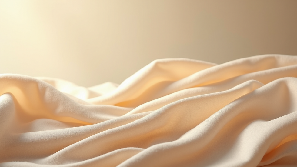
Low Chroma: The Power of Subdued Tones
Low chroma colors can evoke feelings of calm, sophistication, and subtlety. These hues, often seen in shades of gray, beige, or muted pastels, are excellent for creating a tranquil and understated aesthetic.
For designers, incorporating low chroma colors can lead to a more sophisticated look. This is particularly useful in contexts where the goal is to allow content or other design elements to take center stage. Think of a cozy living room with soft, neutral tones that create a relaxing atmosphere — the low chroma palette allows for comfort without attention being drawn away from the people in the space.
Low chroma works wonderfully in branding for products targeting audiences seeking elegance or simplicity. These colors create a sense of timelessness and can enhance the perception of quality. However, while low chroma can convey sophistication, it's crucial to balance this with more vibrant elements to prevent the design from becoming too bland.
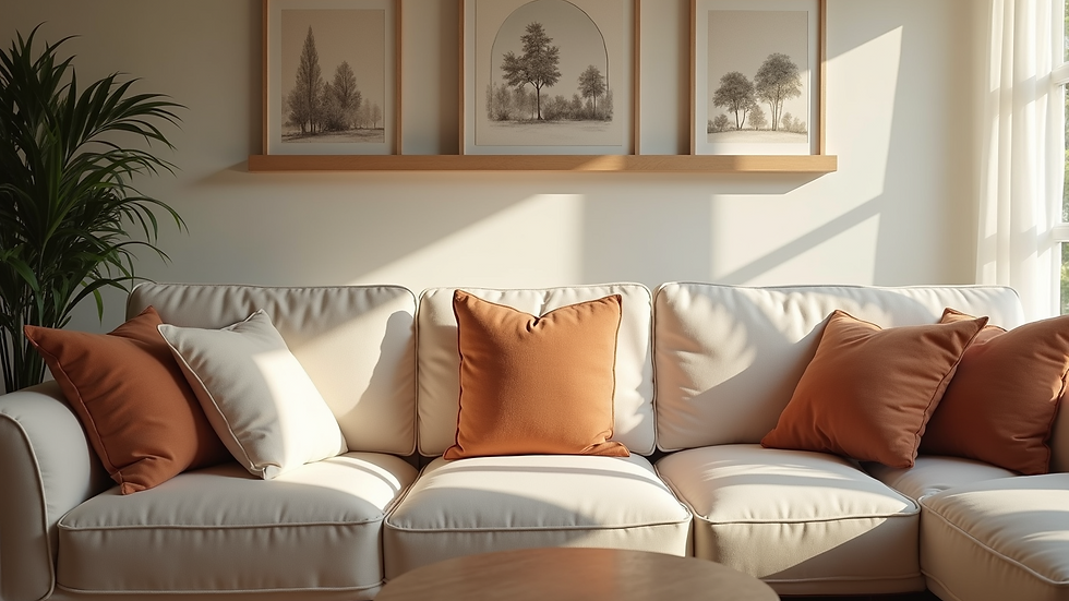
Mid Chroma: Finding the Sweet Spot
Mid chroma colors are similar to a good handshake; they balance warmth with professionalism. They are neither dull nor overwhelmingly vibrant, making them versatile and adaptable for various design applications.
Mid chroma can invoke feelings of warmth and relatability. From soft greens to muted blues, these colors create an inviting atmosphere without being overly assertive. This versatility means that mid chroma is perfect for both commercial and personal projects, as they work harmoniously with other colors while adding an element of liveliness.
Designers can use mid chroma as a backdrop to create a mood that is balanced yet engaging. Picture a cafe filled with mid chroma hues — warm yellows and earthy greens that stimulate conversations while providing a laid-back vibe. When balancing mid chroma and low chroma, the result can lead to designs that feel both lively and serene, creating a pleasant space for anyone.
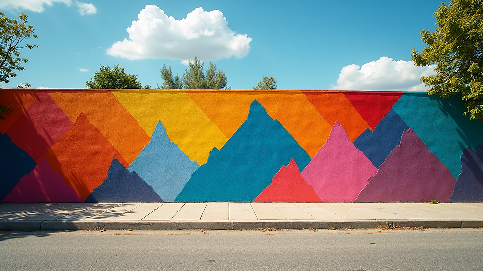
High Chroma: Maximum Vibrance
High chroma colors are akin to a splash of excitement. These colors — think bright reds, electric blues, or vivid yellows — are full of life and can captivate an audience's attention.
However, using high chroma can be a double-edged sword. While they can create striking designs, their intensity can also overwhelm if not used carefully. That's where the balancing act comes in! Consider the classic principle of color theory: contrasting high chroma elements with low or mid chroma backgrounds can enhance the vibrancy while ensuring the design remains aesthetically pleasing.
High chroma colors excel in environments where that energy is beneficial — think of playful children’s room designs or exciting promotional materials for an event. These colors typically invigorate spaces and can lead to enhanced emotional responses from viewers. However, always remember to create balance; integrating high chroma with softer shades can provide a visual anchor that keeps the overall design pleasing.
Practical Applications and Tips
Identify Your Purpose: Before diving into color selection, determine the objective of your design. Are you trying to convey warmth through low chroma colors? Or aiming to energize with high chroma? Clarity in purpose lays the foundation for effective design.
Balance is Key: Aim for harmony by combining various chroma levels. Use low chroma colors for backgrounds, mid chroma for elements you want to highlight subtly, and high chroma for attention-grabbing focal points.
Test and Iterate: Colors can often look different in physical and digital environments. Always prototype your designs and see how different colors interact in the setting where they will be used. Iterate based on feedback, and don’t shy away from making bold chromatic choices.
Cultural Considerations: Colors carry different meanings in various cultures. Always consider your target audience and the emotions you want to evoke with your design choices.
Use Tools Wisely: Utilize color theory tools and apps to see how different chroma combinations work together. These tools can help visualize your ideas and inspire creativity for your project.
Conclusion
Color is powerful in design, and understanding the nuances of low, mid, and high chroma can lift your design game. Each chroma level has its place, and mastering this balancing act opens the door to endless creative possibilities.
As you explore the rich palette of colors available, keep in mind the emotional responses you wish to evoke and the harmony you wish to achieve. By skillfully blending these chroma levels, you can engage your audience, create stunning visuals, and ultimately, elevate your designs to captivating experiences.
Happy designing!


